Web Elements
Every piece of content we publish is supported by a number of smaller pieces. This section lays out our style in regards to these web elements, and explains our approach to the tricky art of SEO.
Alt Text
Alt text is a way to label images, and it's especially important for people who can’t see the images on our website. Alt text should describe the image as specifically as possible. For more on how and why we use alt text, visit
QAF 624.
Buttons
- Label buttons with what they do.
- Button copy should always include verb.
- The button label should answer the question: "I want to..."
- Request Appointment
- Get More Info
- Learn More
- Send Email
- Subscribe
- etc.
- Make buttons look like buttons.
- Use rounded corners (3px min)
- Contrast is key
- A light button won’t stand out against a light background as a dark button would. On top of that, the copy needs to stand out against the button, too.
Forms
- Form titles should clearly and quickly explain the purpose of the form.
- Use
title case for form titles and sentence case for form fields.
- Checkboxes
- Use sentence case for checkboxes.
- Drop-down menu
- Use sentence case for drop-down menu items
- Radio Buttons
- Use sentence case for radio buttons
- It is expected the included form field is aligned with the appropriate form type.
- Phone (form label) = Phone number (field type)
- Email (form label) = Email (field type)
- Zip (and the like) (form label) = Number (field type)
- Date (form label) = Date (field type)
- Time (form label) = Time (field type)
- Message, Question, and the like (form field) = Long text (form type)
- Do not include message field if client's business is healthcare service related
- Doctors
- Dentists
- Pharmacies
- Chiropractors / physical or occupational therapists
- Nursing homes
- Counselors and therapists
- Insurance providers that deal with medical / life / health / dental
- Custom forms may not exceed 25 fields and may be added to any page except homepage
- Custom form cannot ask for sensitive data such as medical and financial questions. See
list.
Headings
- Headings and subheadings organize content for readers. They should include the most relevant keywords and cover/highlight the main point(s) of the page.
- Headings and subheadings are written in title case.
- Avoid using end punctuation except for question marks or when a heading is two or more sentences.
Links
- Provide a link whenever you’re referring to something on an external website. Use links to point users to relevant content and trusted external resources.
- Don’t include preceding articles (a, an, the, our) when you link text. For example:
- No - Read our warranty for additional details.
- Yes - Read our warranty for additional details.
- If a link comes at the end of a sentence or before a comma, don’t link the punctuation mark.
- Use color or style to make the links look different than regular copy, strong text, or emphasis text.
Typography
Typography refers to how type — meaning letters and characters — are arranged and presented on the page.
- Limit the number of typefaces per website.
- To maintain visual cohesion throughout your content, use no more than two different typefaces across your website. Many websites do just fine with one typeface, especially if they apply different fonts within the typeface for different purposes (like headings, body, button text, etc.).
- Use a sans serif font for body text.
- While serif fonts are common in printed text, typography experts generally agree that sans serif fonts are actually more readable in digital contexts. Our eyes follow web text better without the decorations.
- This doesn’t mean you can’t use serif fonts on your website at all — a serif text in a title, heading, pull quote, or decorative section can draw attention and provide nice contrast. However, for blocks of text that require more effort to read and understand, your text is better “sans.”
- Size your text appropriately.
- A common practice is to set all global text to a minimum size of 16px. This is roughly the size of body text in printed media, and is the smallest font that most people can read without needing to zoom in. Of course, you can and should increase and vary the size of your text to further assist readers and establish hierarchy, but don’t go overboard with massive fonts either.
- On the subject of hierarchy, headings should always be larger than body text and decrease in size by H1, H2, H3, etc. This helps readers scan your pages for the target content. You might also elect to add varying weights to your headings for a greater contrast with body text.
- Use colors carefully and intentionally.
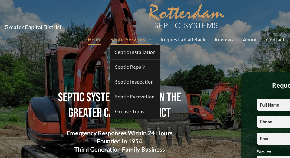
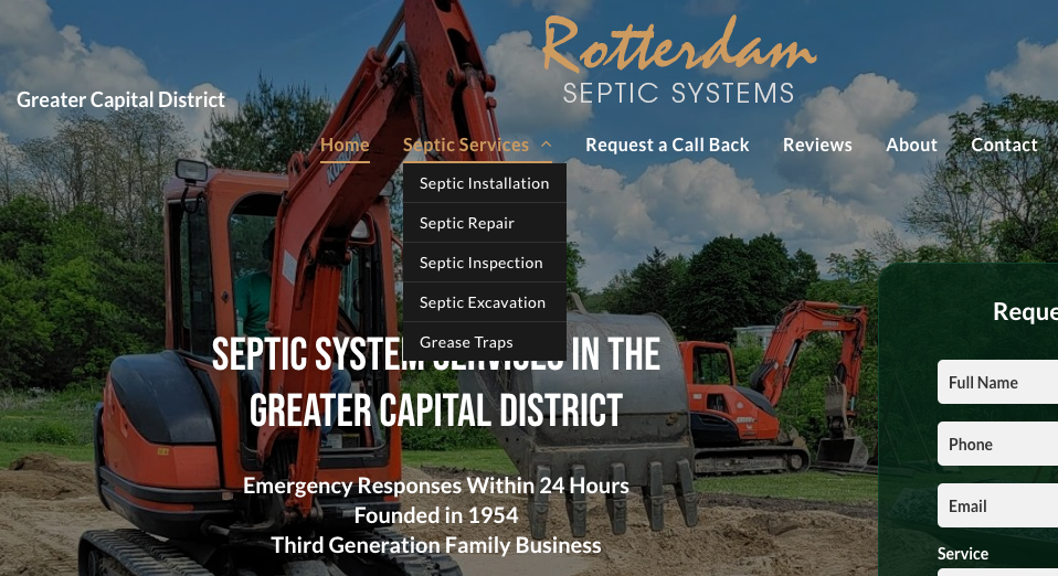
- A common pain point for web users is a bad pairing of text color and background color, in which the two do not contrast enough to maintain legibility. Refrain from layering text over a background with similar colors, and be very cautious when placing text atop images.
- Aside from contrast, be mindful of your choice of body text color as well. It’s best to keep your body text one uniform color with the exception of hyperlinks, which should contrast with the rest of the text. Avoid using blue as the default color in your text, since it implies a hyperlink.
- Provide sufficient spacing between lines.
- Proper whitespace ensures that readers can easily follow single lines of text and return the next line after a line break.

